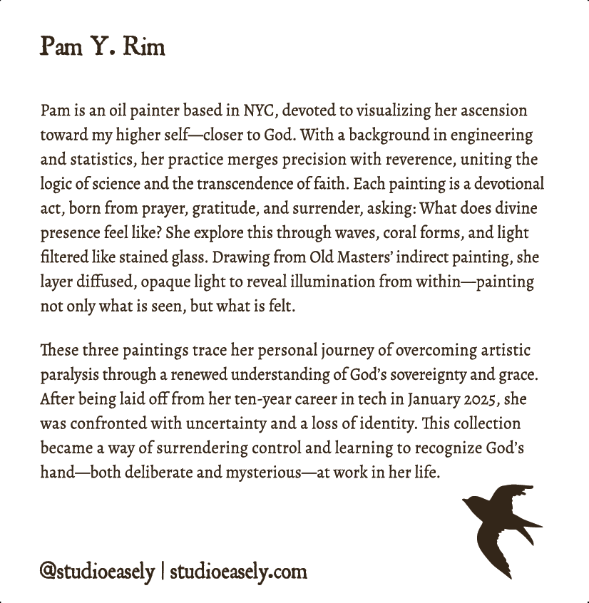
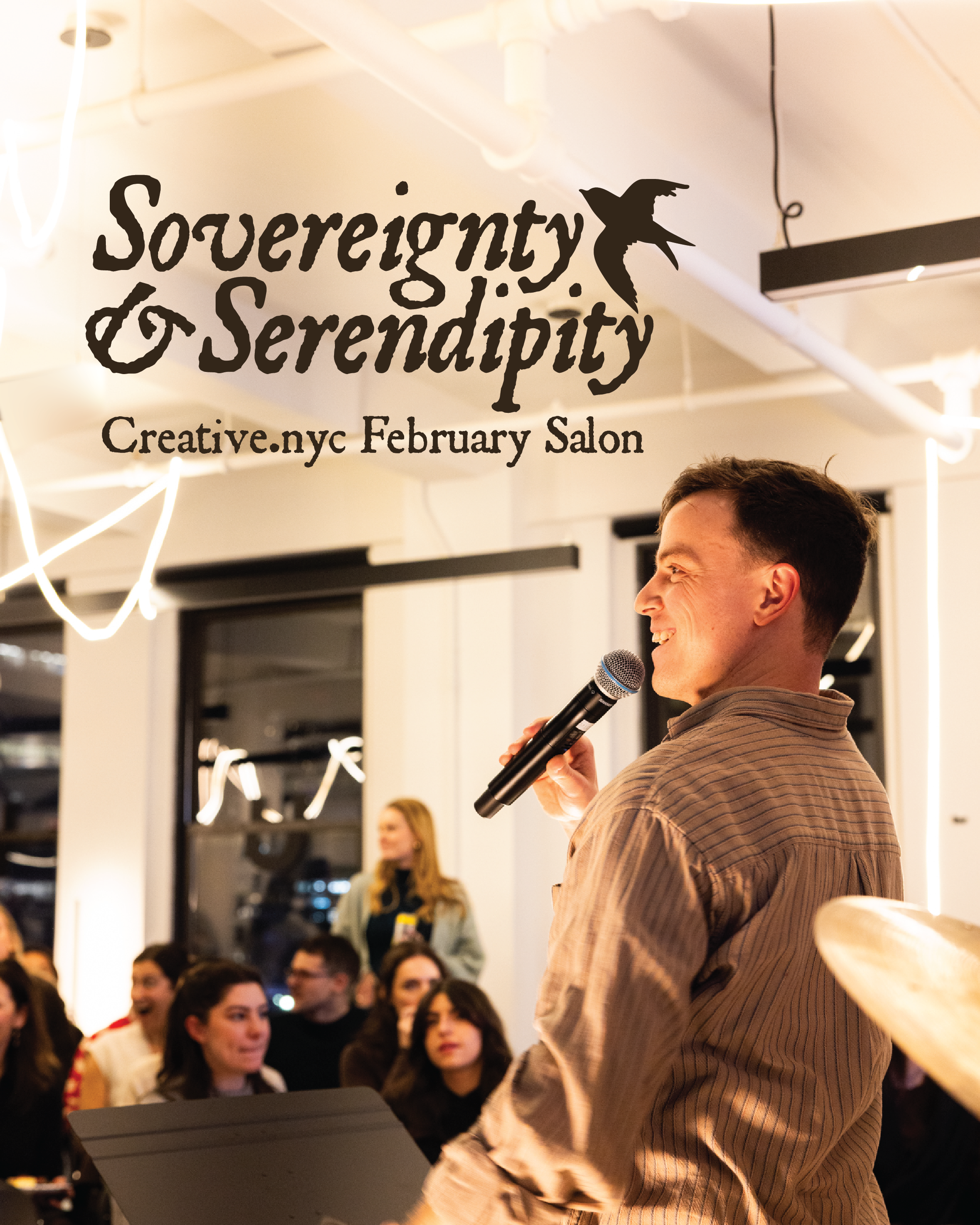
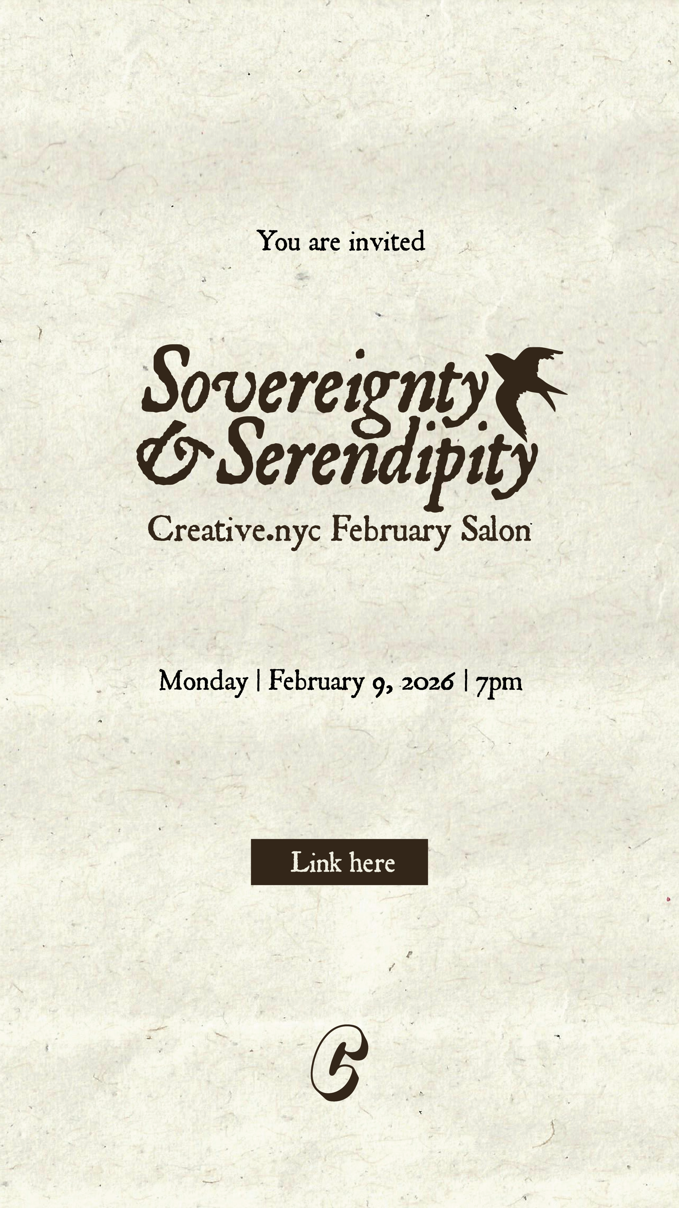
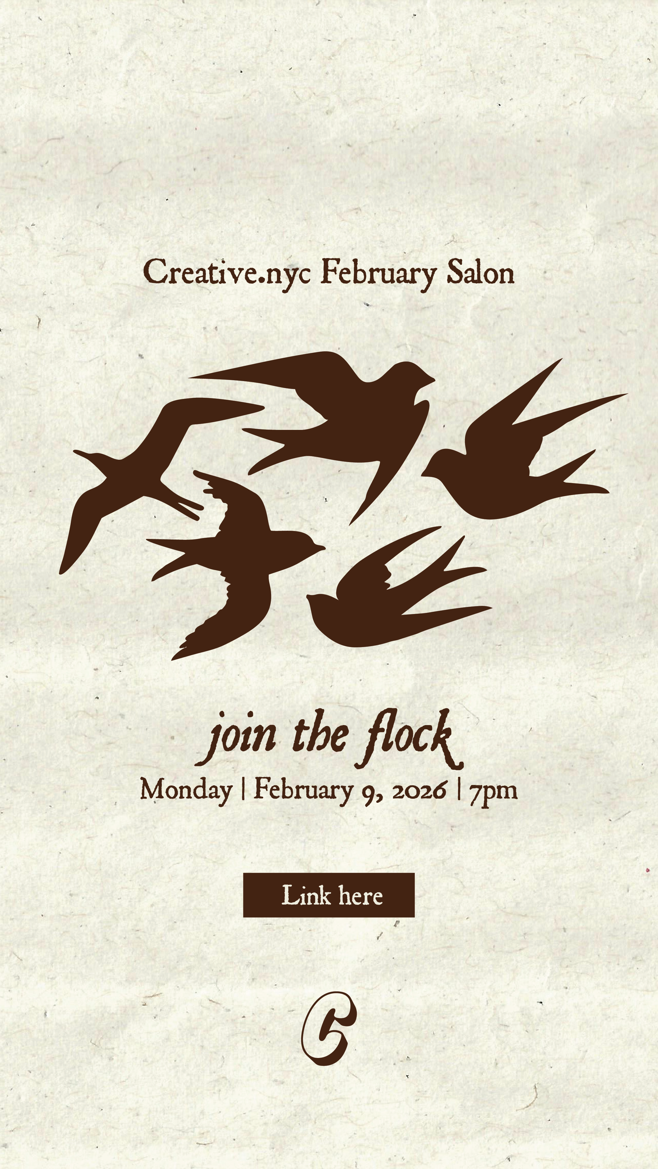
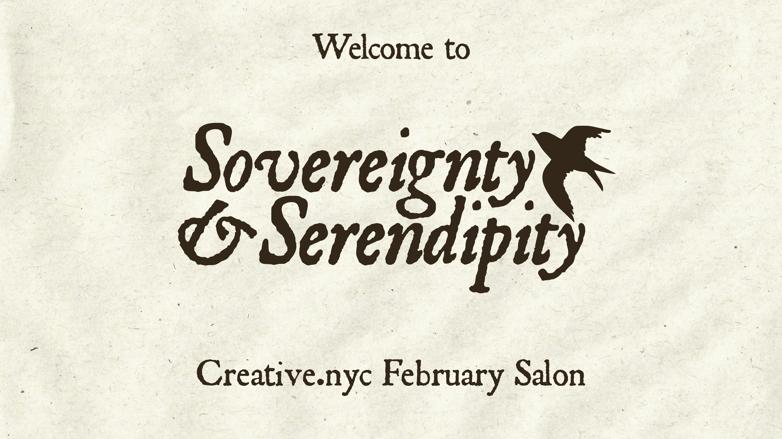
Sovereignty & Serendipity
Creative.nyc February Salon
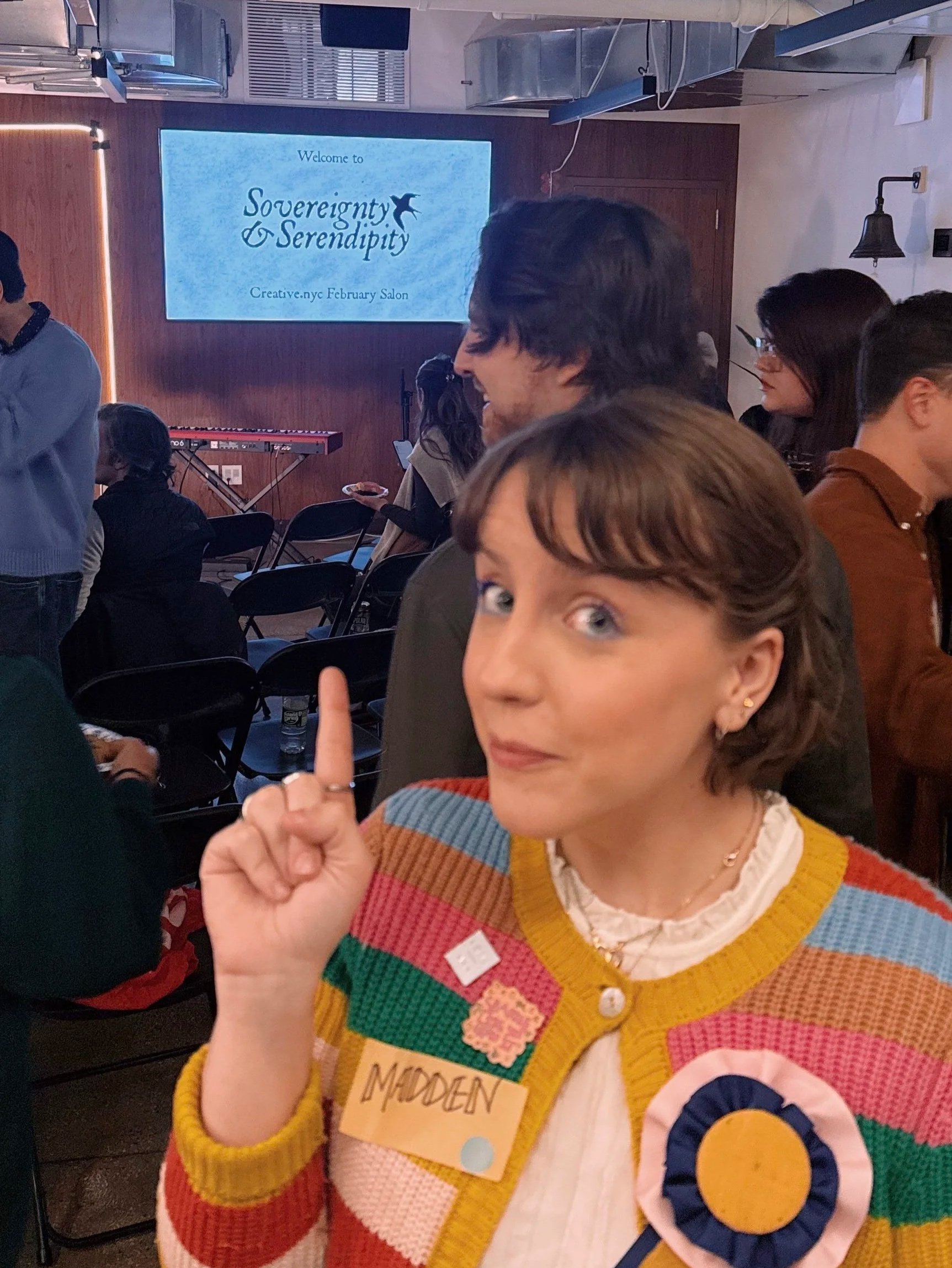
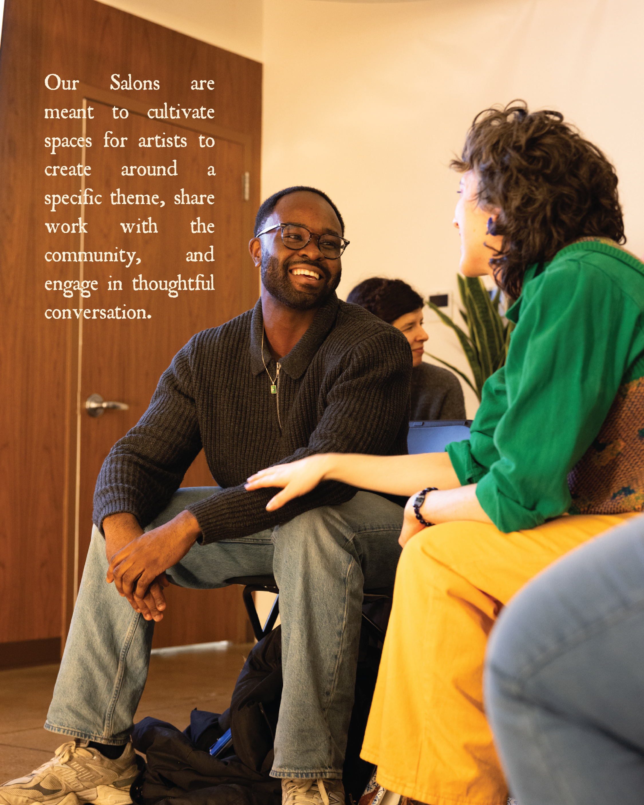
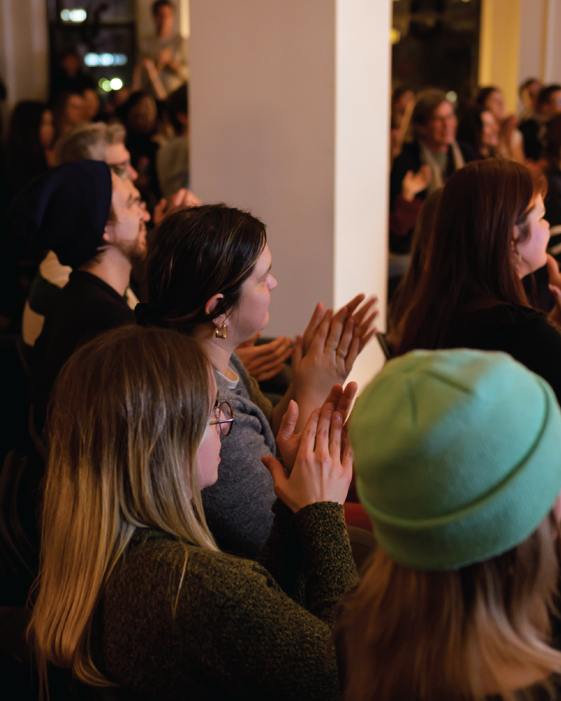
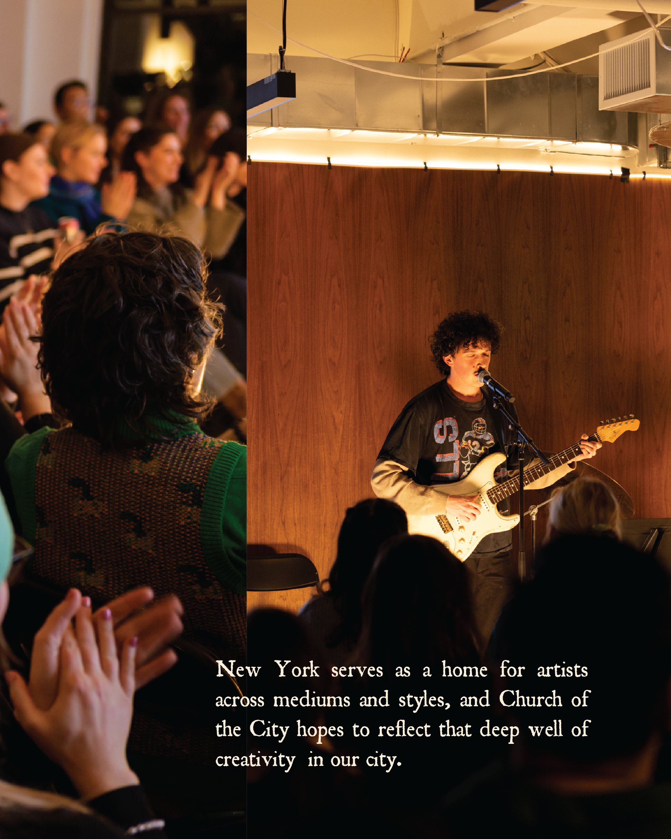
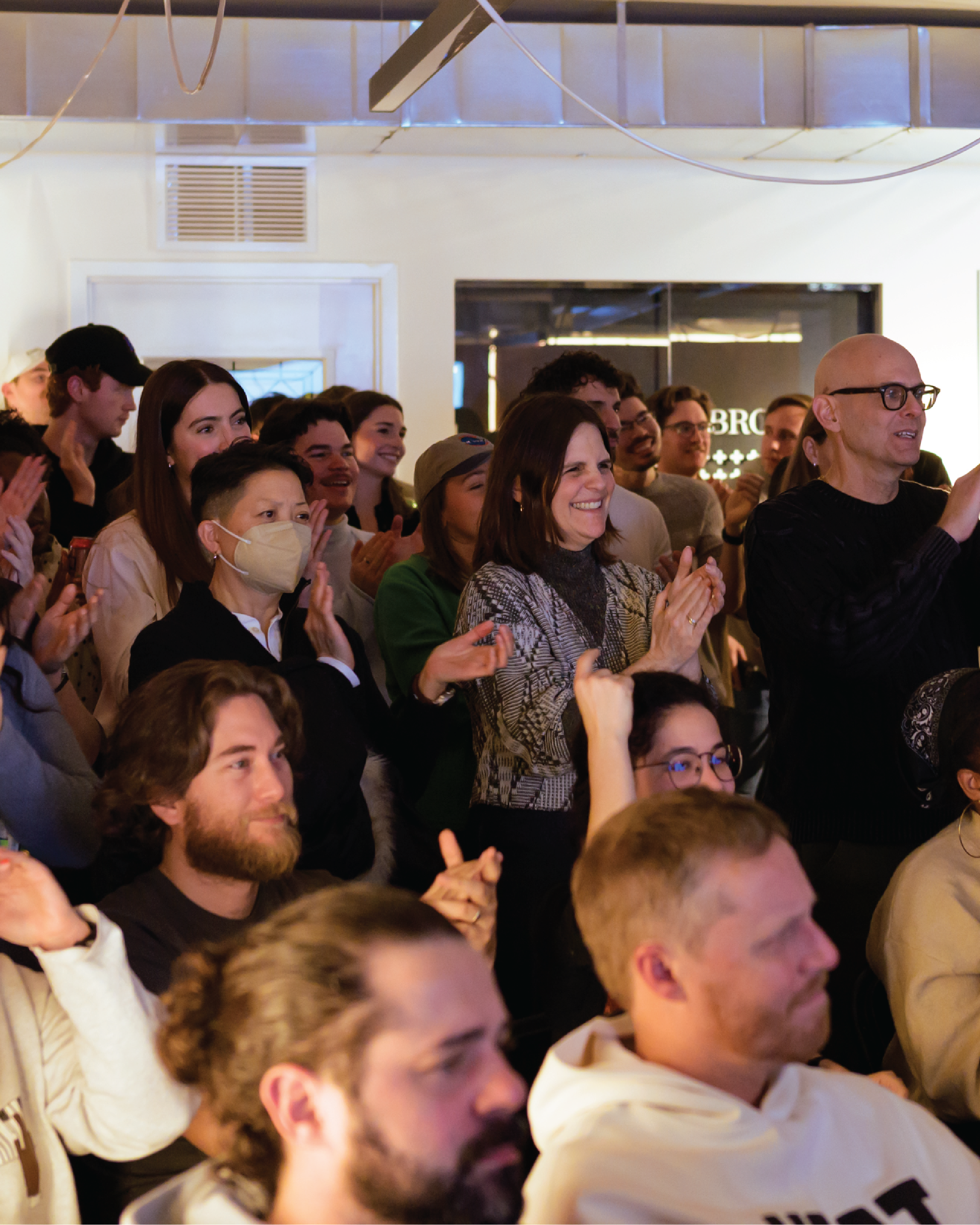
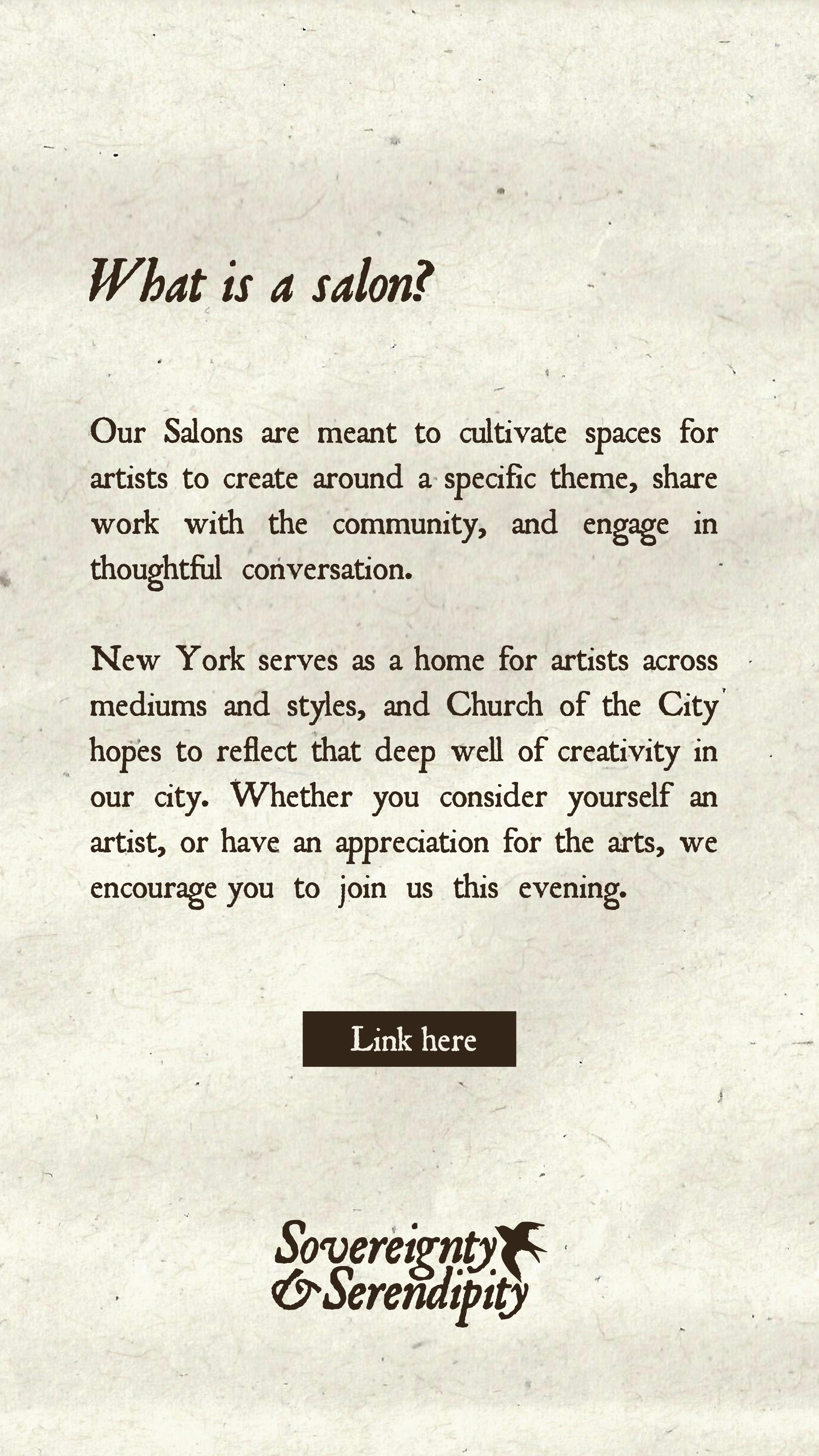
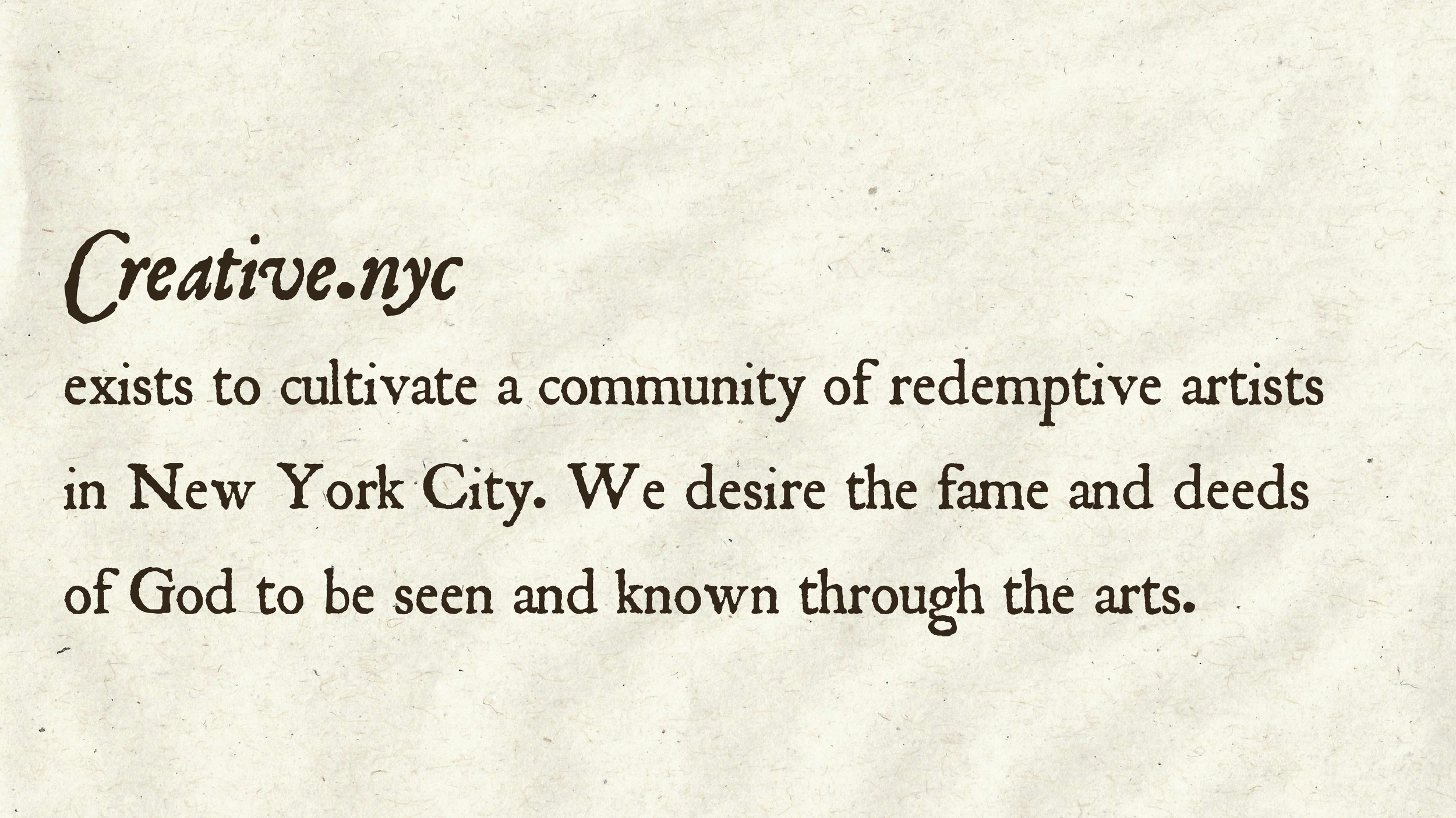
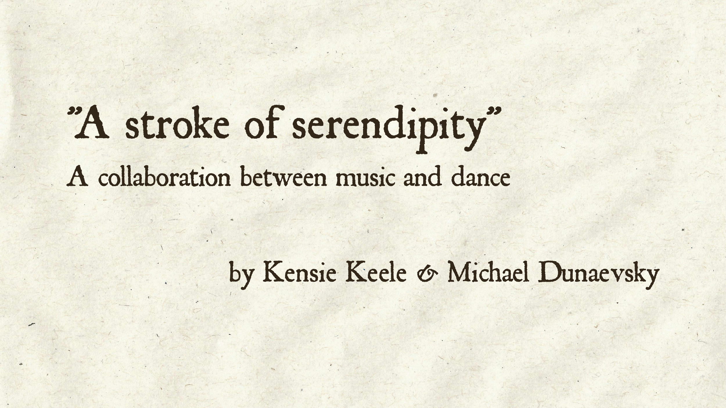
Creative.nyc is Church.nyc’s community of redemptive artists in New York City. Each month, creative.nyc host a salon which is a space for artists to create around a specific theme, share work with the community, and engage in thoughtful conversation. I designed all print and digital materials for the February 2026 Salon.
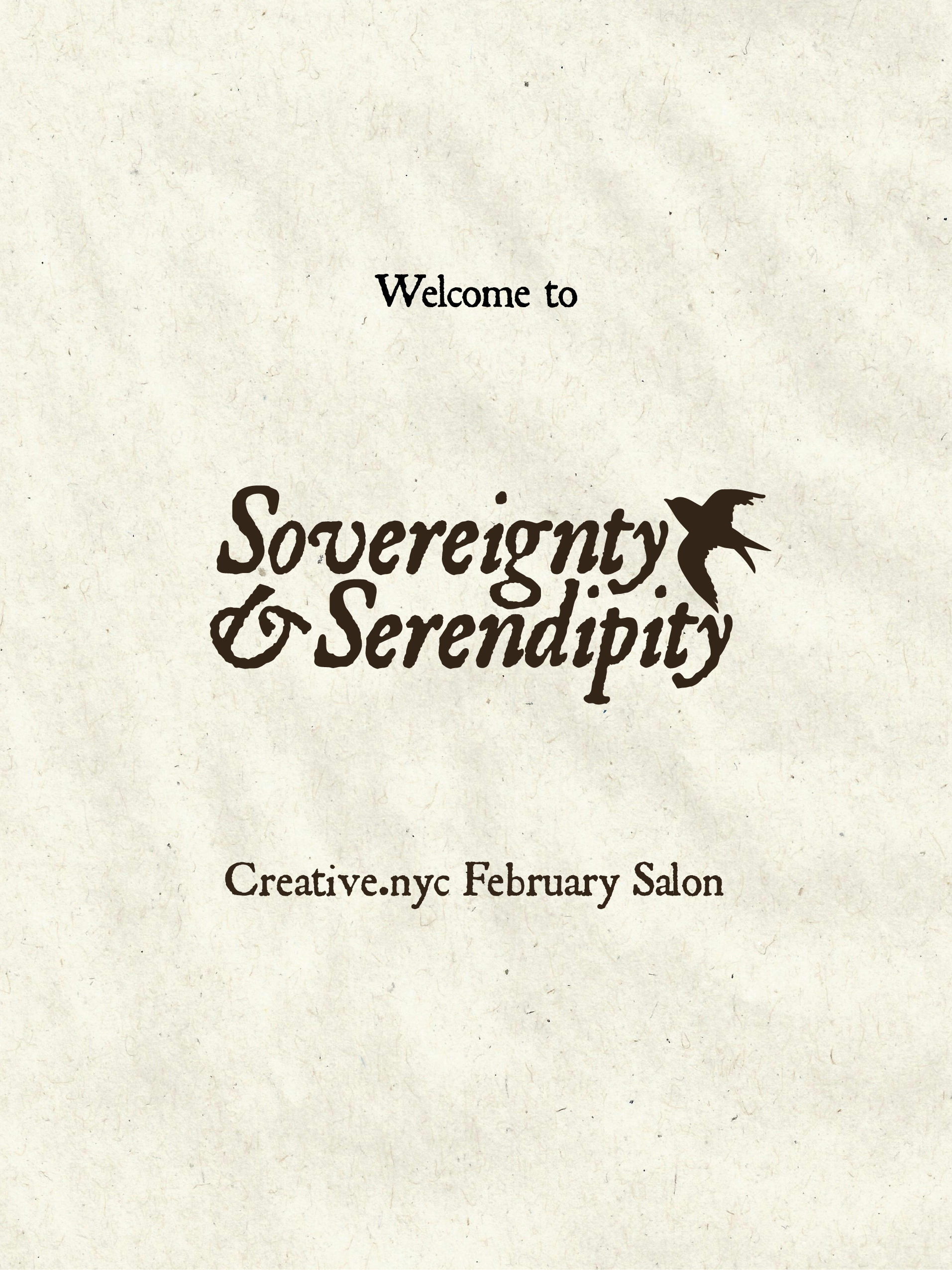
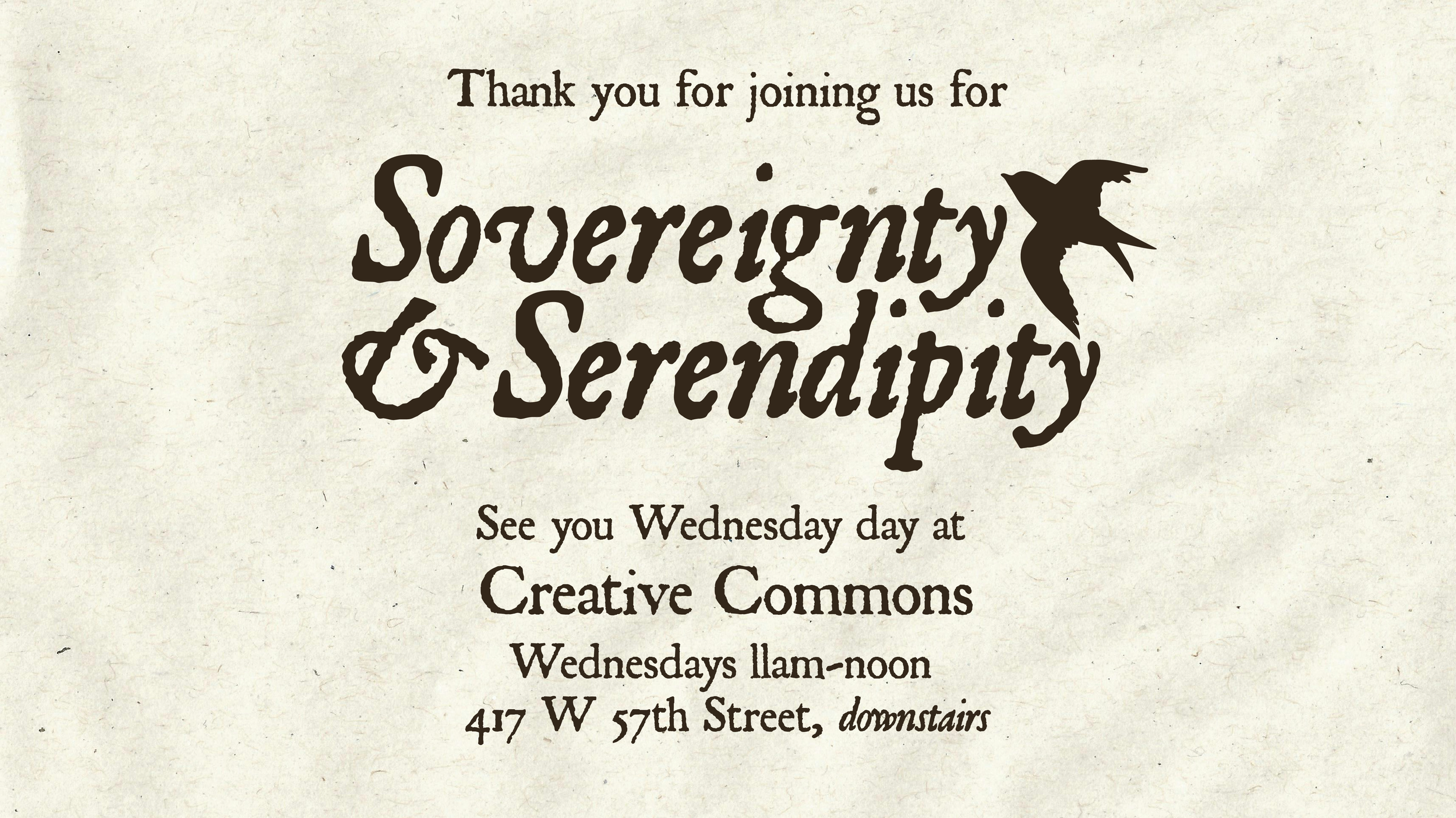
The theme of the Salon was Sovereignty & Serendipity. When creative.nyc’s director Josh Dunn and I were brainstorming what we wanted this event to feel like, we kept coming back to themes of nature and drawing towards texture. Serendipity often makes us feel connected with the world and the greater chain of history, so I created a color palette that was very earthy and used fonts that felt ancient and antique. Meanwhile, sovereignty feels so much bigger than coincidence, bigger than the “butterfly effect,” so I decided to include the image of a bigger winged creature, a swallow, to represent that phenomenon. Swallows often represent good luck and freedom, topics often discussed alongside serendipity.
Large Posters
These posters were located at the front of the gallery space. It was important to me to create a welcome poster to place at the opening of the elevator so family, friends, and first-time guests could be assured upon their entrance that they had made it to the correct location.
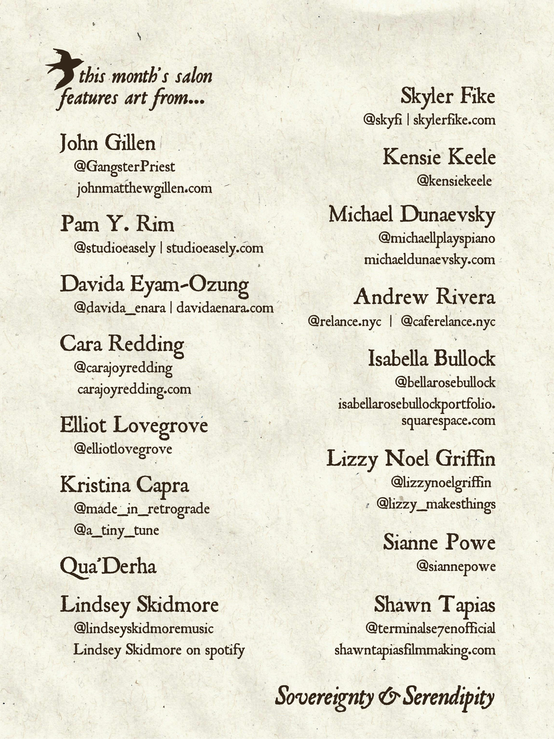
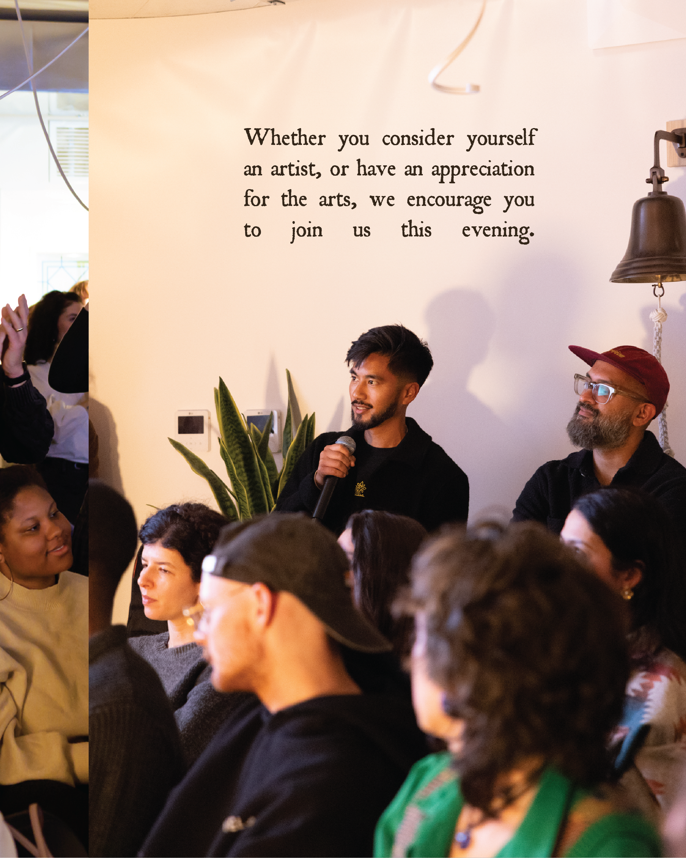
The second poster includes all artists names and their websites and social media handles. I wanted there to be a place for attendees to find their work online so the presenters didn’t have to use their presentation time to plug their socials. I wanted presenters to be able to focus on sharing their creative journeys and encounters with the Holy Spirit and answering audience questions.
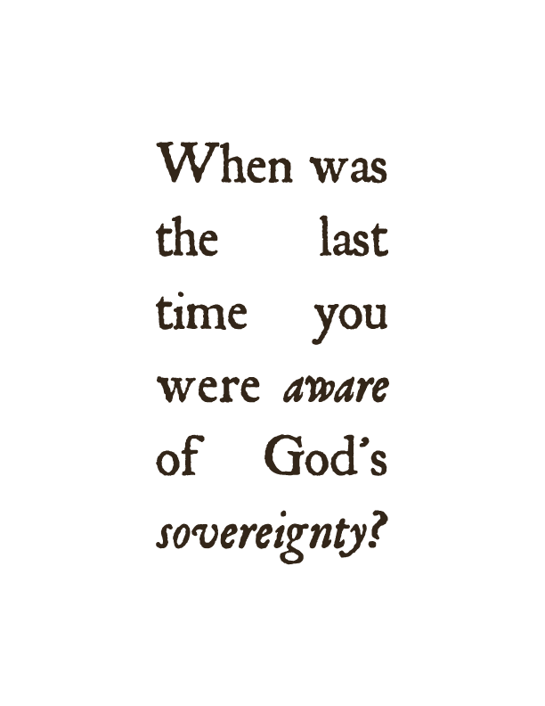
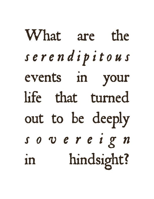
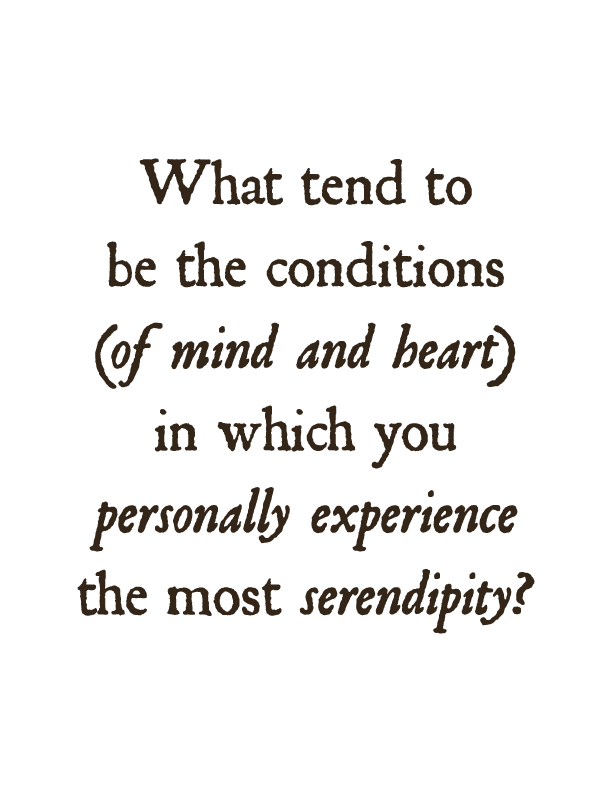
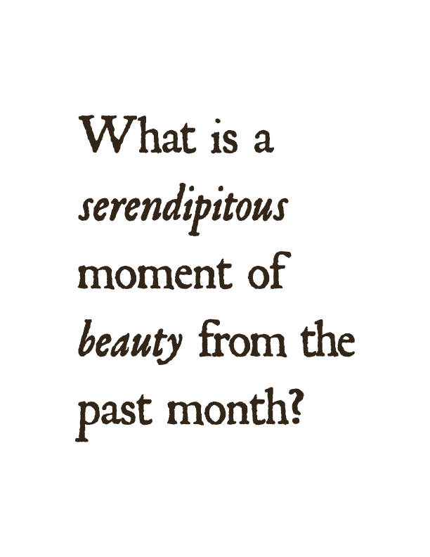
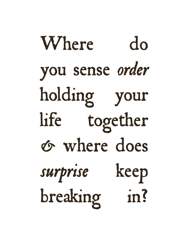
Small Posters
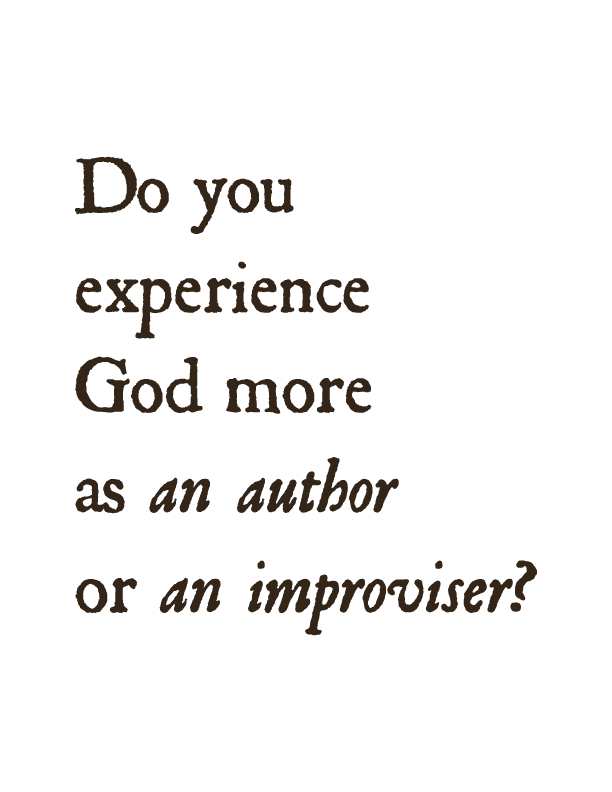
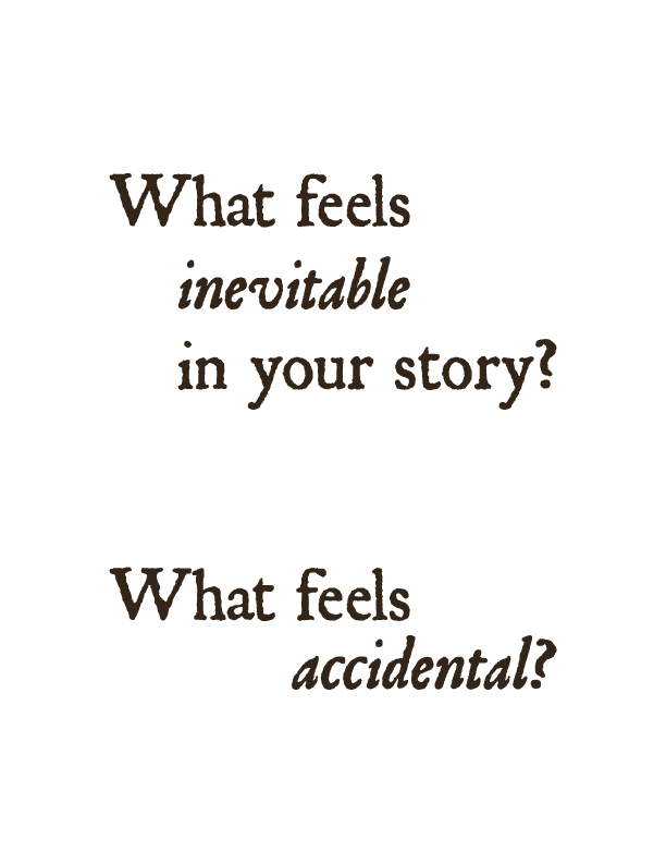
Josh and I wanted to figure out a way to encourage patrons to move around the room and interact with space, outside of just looking at the art. The stated purpose of these salon gatherings is to create space for conversation, but we wanted to come up with a practical way to acheive that goal. We decied to print posters with discussion questions on them and place them through out the room, inbetween artworks on display. I made the type compelling and interesting to look at, without distracting from the content or the surrounding artwork.
Seemless Instagram Carousel
Instagram Story Series
Type-Setting
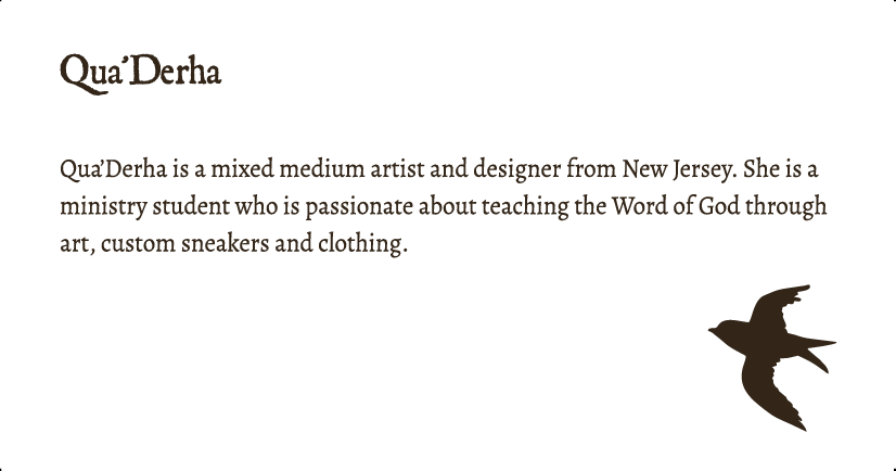
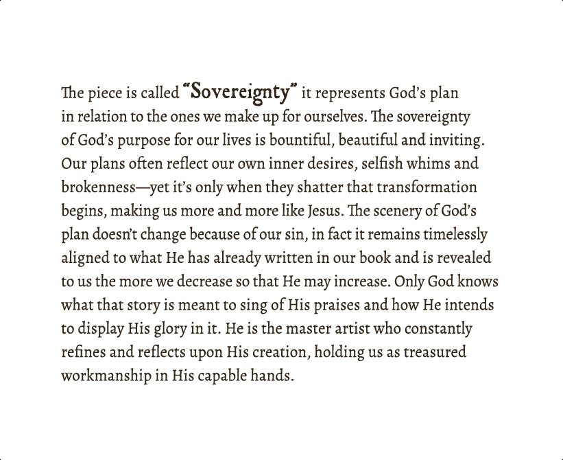
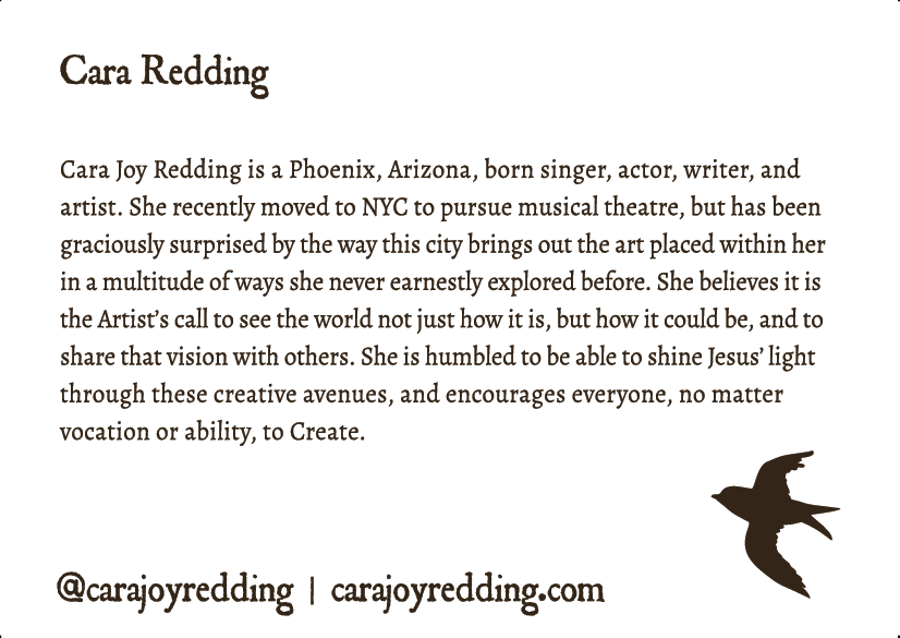
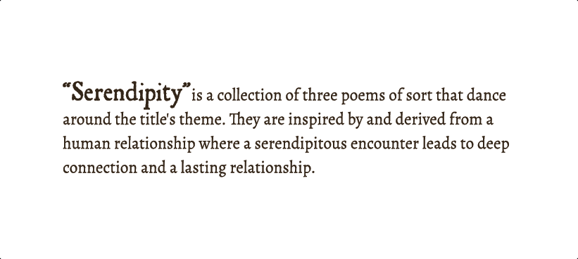
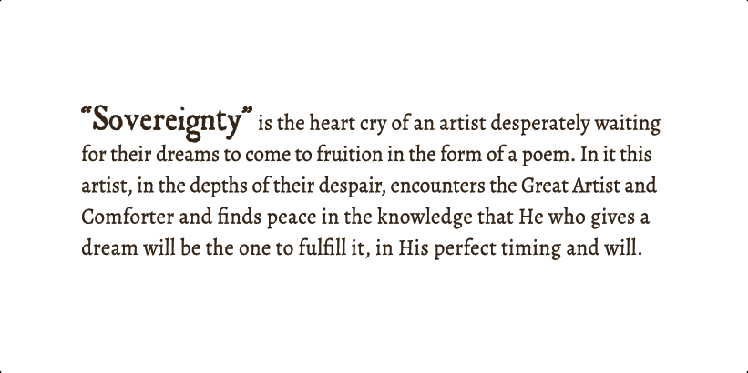
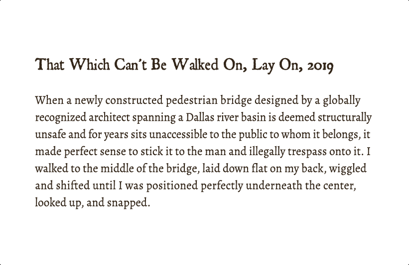
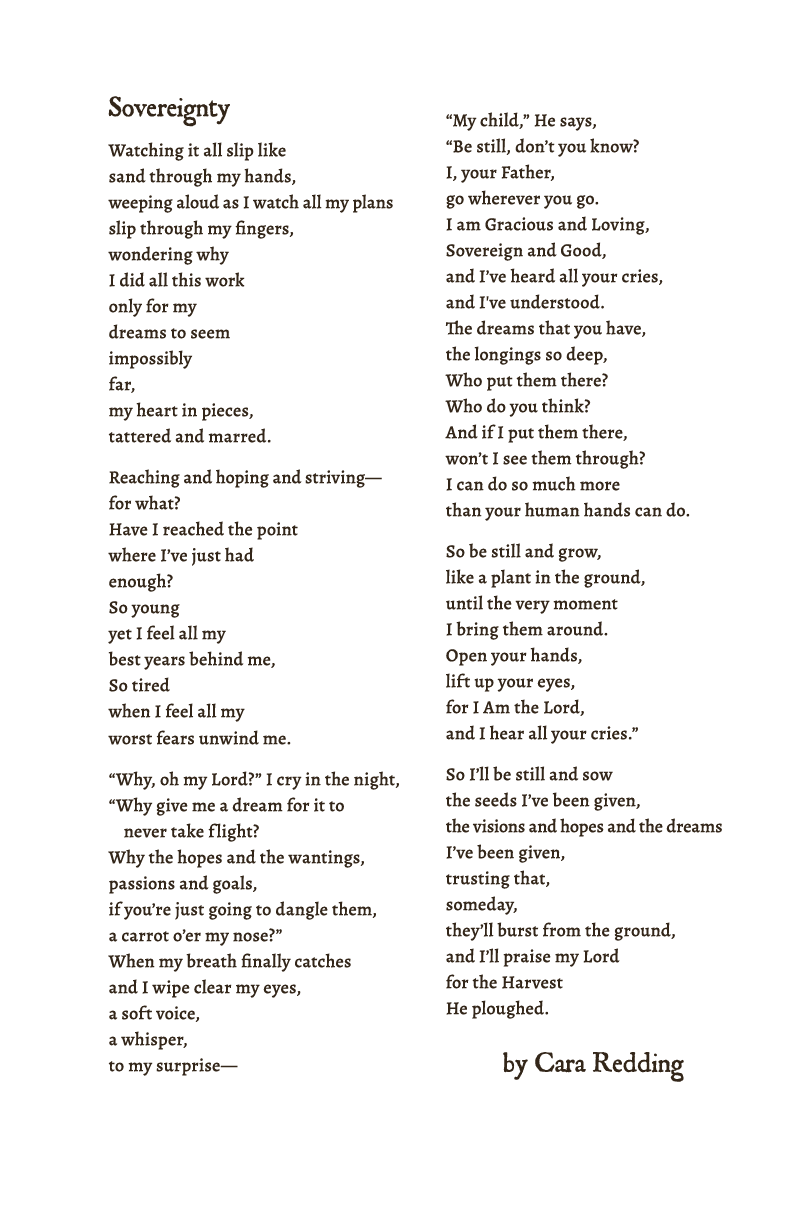
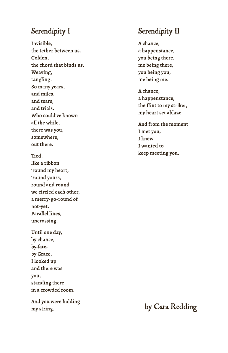
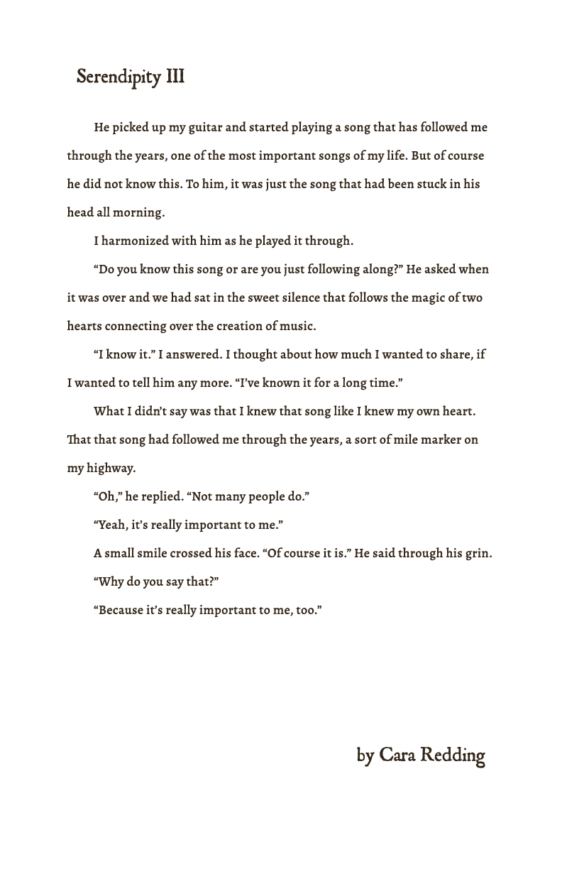
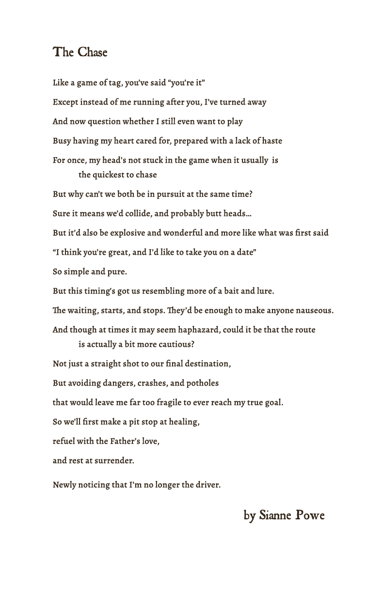
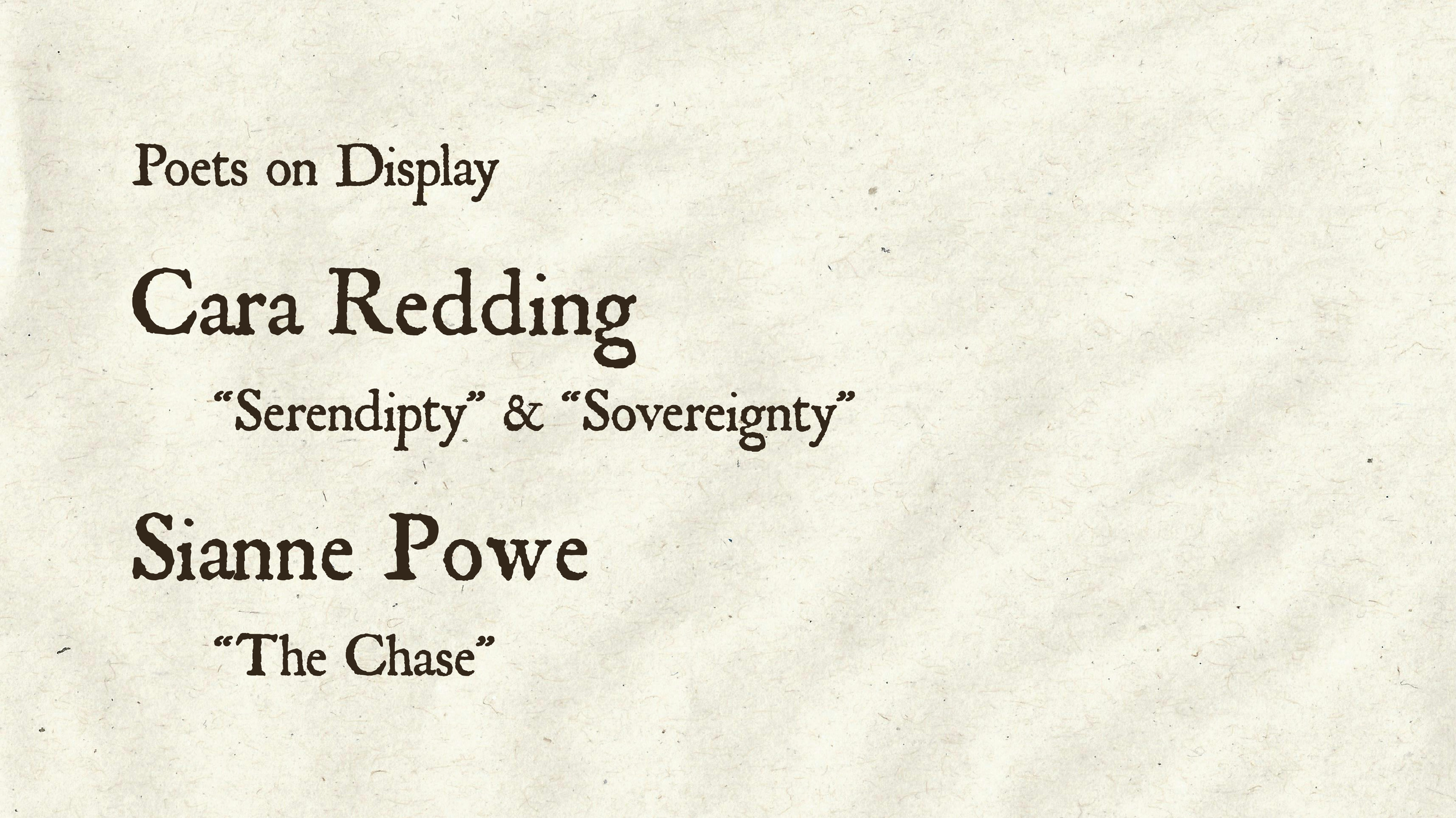
The painters and sculptors who present work at the salon are responsible for bringing in their works, but poets don’t have physical work to share. It was my responsibility to present the writers’ works in a way that would do their words justice. I wanted to make sure these pieces were not only legible, but readable. I wanted to make sure the type size was large enough to read even with a crown around. I also wanted to respect the line breaks and paragraphs the writer included. I wanted the works to be read naturally how the writer intended.
Presentation Deck
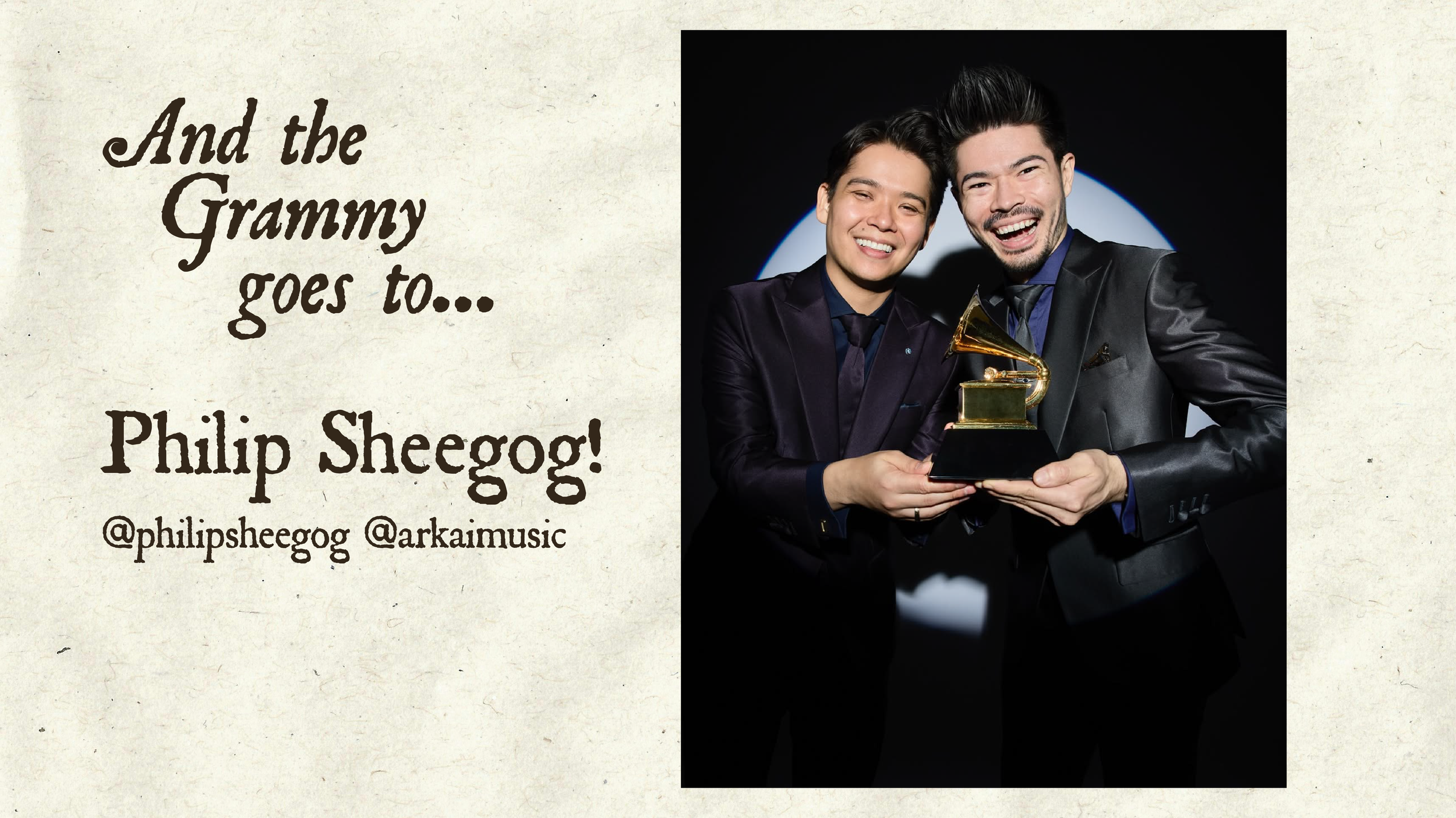
This deck played behind the artists as they presented. I find that a visual presentation is necessary to a verbal presentation. Keeping audiences stimulated is imparitive to keeping their attention. Giving the audience each artists’ name typed out on screen helped reduce misunderstandings and miscommunications. Showing the art the artist was discussing helped give the audience context for the details they were discussing.
Placard Design
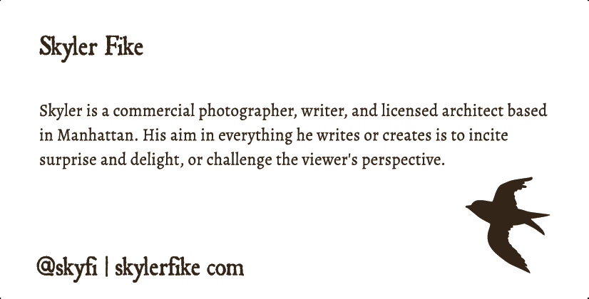
Similar to the poems, I wanted to make sure these placards were not only legible, but readable. I wanted to make sure the type size was large enough to read even with a crowd around. The artists put time and effort into writing their bios and describing their works. I wanted to make sure these cards would be read. I also included social media handles under the artists’ names to ensure they could connect with their audience.